WEBSITE CREATION | STRATEGY, COPY & CONTENT
Websites are a crucial part of business marketing and are often a client's first interaction with a company and its brand. A website needs to clearly outline the nuts and bolts of a company's services, products, and what they offer, but more so needs to communicate who they are and what they are all about. A consumer needs to feel what the company is all about immediately from visiting their site.
Below you will see some examples of different builds that utilize functionality and evoke a feeling, allowing the structure, graphics, and copy to convey each organization's services, brand, and story.
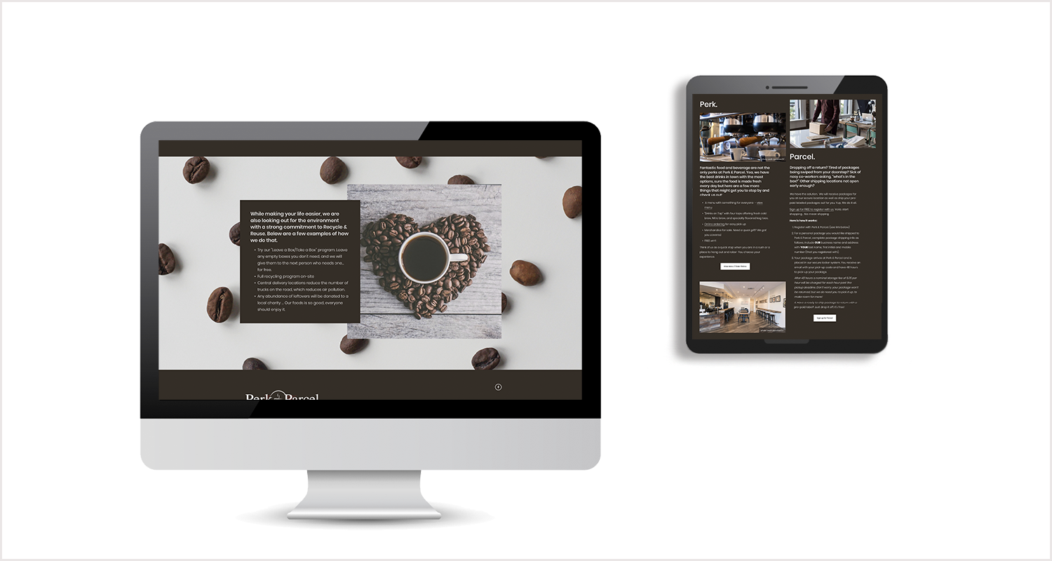
PERK & PARCEL: A new coffee shop with a new concept: Coffee and Shipping in one place. I created a site that was warm and welcoming while also having a modern feel for a new concept of secure locker technology.
VERGENCE INSTITUTIONAL PARTNERS: The goal was to create a new website for an investment consultant of retirement plan sponsors. The company wanted to stand out from the crowd of competitors as fresh and new, while not alienating a known demographic of traditional clients. The tag line of "A different perspective" emphasizing new and different and drove the look and feel of the site. No retirees sipping coffee on the dock on this site.
DAYLA ARABELLA INC. : Dayla often got the question, “what exactly do you do?” The goal of this website redesign was to answer that question quickly and clearly. Bold headlines and imagery supported by clean, concise copy and easy navigation did just that. Oh, and while we were at it, we designed a new logo too!


